Because of the various things we do (see previous post), from daily ones like eating, commuting, heating our homes, using computers and phones, buying stuff, to less frequent ones like long-distance travel or, say, buying a new car, we end up generating each of us several tons of greenhouse gases per year. Often called the carbon footprint, although “greenhouse gas footprint” would be more accurate, this amount is the impact we individually have on climate and on the global heating process. How much is it on average per person, and how does this average varies across countries, but also within each country?
In 2018, total anthropogenic greenhouse gas emissions, in other words emissions originating from human activities, reached the mammoth amount of 55.3 Gigatons of CO2e (latest figure from the United Nations Environment Programme, published in its annual Emissions Gap Report, 2019 edition1).
Dividing this total by the world population of 7.7 billions people (precisely 7 713 468 thousands persons, using figures from World Population Prospects 2019: Data Booklet, United Nations), we get an average carbon footprint of 7.2 tons of CO2e per year for each living person on this planet.
Needless to say, the average per capita varies considerably depending on where we live, how much we buy and consume, and what activities we do. Looking at the numbers of a few countries (below table), average emissions per year range from 0.7 ton CO2e in a country like Malawi, to 20.8 ton CO2e in Saudi Arabia or higher (in a few other countries).
Greenhouse gas emissions per capita per year, in CO2e, for selected countries:
| European Union: 8.5 ton CO2e/capita | China: 9.2 ton CO2e/capita |
| Poland: 10.5 ton CO2e/capita | Russia: 18.5 ton CO2e/capita |
| France: 7.0 ton CO2e/capita | India: 2.2 ton CO2e/capita |
| Danemark: 9.0 ton CO2e/capita | Saudi Arabia: 20.8 ton CO2e/capita |
| Portugal: 6.6 ton CO2e/capita | South Korea: 14.3 ton CO2e/capita |
| Japan: 10.3 ton CO2e/capita | Indonesia: 2.6 ton CO2e/capita |
| Germany: 11.2 ton CO2e/capita | Ethiopia: 1.2 ton CO2e/capita |
| United Kingdom: 7.5 ton CO2e/capita | Mali: 2.2 ton CO2e/capita |
| United States: 20.3 ton CO2e/capita | Malawi: 0.7 ton CO2e/capita |
Source: Postdam Institute For Climate Impact Research, PRIMAP-hist national historical emissions time series2, 2016 figures, also available on the Climate Watch data platform of the World Resources Institute
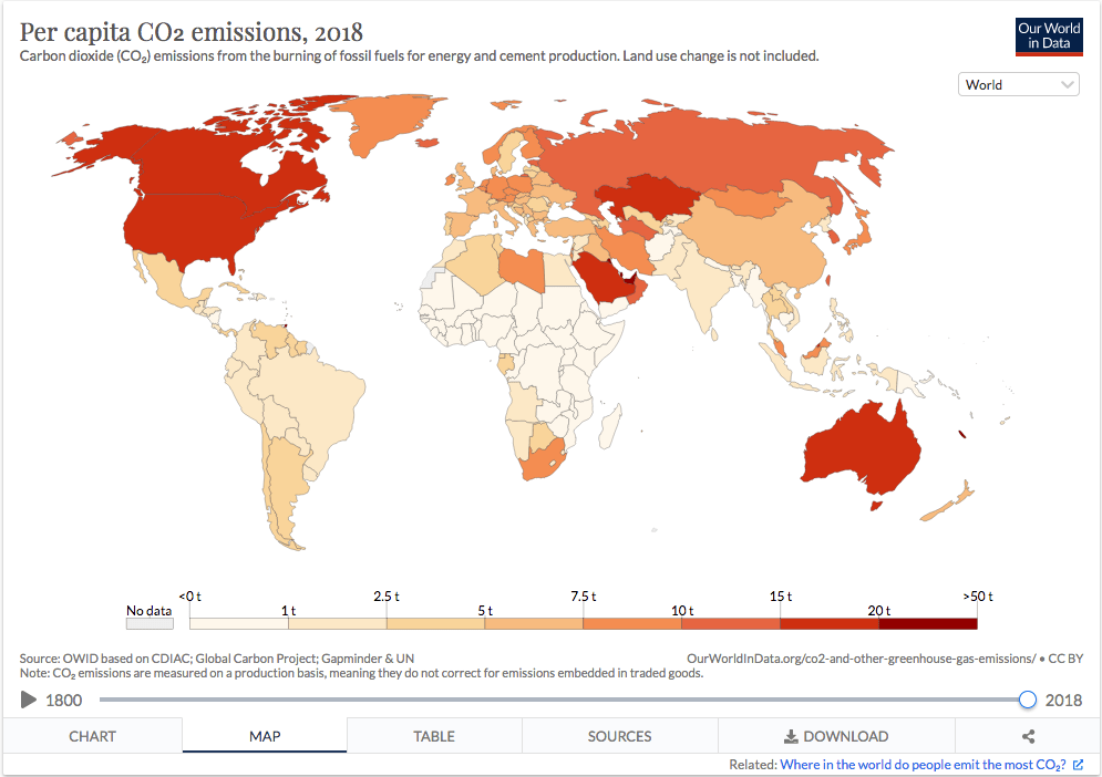
The map below provides an overview of how emissions per capita vary between countries. It comes from the excellent article “CO₂ and Greenhouse Gas Emissions” by Oxford researchers Hannah Ritchie and Max Roser3. You can access the interactive map here, (below is only a screenshot), with history of per capita emissions since 1800. Note that figures on the map are CO2 emissions and not CO2 equivalent (not including other greenhouse gases), unlike figures in the table further up expressed in CO2 equivalent (CO2e).
Below is a ranking of countries by average emissions per capita, from highest to lowest (reproduced here with the kind authorization of his author, Ville Seppälä). Note the distinction between production emissions, also called territorial emissions, referring to emissions allocated to the geographical area where they were produced, and consumption emissions, which are emissions allocated to the place where the goods or services are consumed. With this distinction, we can easily factor in imports and exports when attributing emissions to a country. (For instance, a good produced in China but bought and used in a European country will increase the consumption emissions of the latter, while decreasing the consumption emissions of China).

Dispersion of individual emissions within countries and across income groups
The comparison of emissions per capita across countries only shows one part of the picture. To see the other part, we need to look within each country, where disparities at the sub-national level may often be larger than at the international level. In a seminal paper, Carbon and Inequality: From Kyoto to Paris4, Lucas Chancel and Thomas Piketty show, for instance, that CO2e emissions inequalities between countries have been decreasing between 1998 and 2013, but within countries inequalities have been increasing in similar proportions during the same period.
In a recent research focused on Europe, The unequal distribution of household carbon footprints in Europe and its links sustainability5, authors Diana Ivanova and Richard Wood estimate that the top 1% emitters among European Union inhabitants have a carbon footprint of 43 tons CO2e per capita per year, the top 10% EU emitters have a average footprint of 19 tons CO2e per capita, and the footprint of the bottom 50% hovers around 4 tons CO2e per capita. The top 10% of EU population, they observe, contribute as much to the EU carbon footprint as the bottom 50% (respectively 27% and 26%).
Not surprisingly, there is a tight correlation between consumption, income levels and greenhouse gas emissions. As Chancel and Piketty4 explain: “income alone cannot predict an individual CO2e emissions level within a country with a high degree of precision. However, income or consumption level remains the main driver explaining variations in total CO2e emissions among households and individuals and it is the best available proxy if we want to construct a global distribution of CO2e with individual level emissions, rather than national per capita averages, as the building block.” (For a literature review of the correlation between income, consumption and environmental impact, see also, among others: Wiedmann, T., Lenzen, M., Keyßer, L.T. et al. Scientists’ warning on affluence. Nature Communications 11, 3107, 2020).
To put this in perspective, it is at least as relevant, if not more, to analyze the distribution of carbon footprints by income groups, within or across countries, rather than simply looking at nationally-averaged per capita emissions. The chart below, from an Oxfam briefing from 2015, illustrates this well.

“Per capita lifestyle consumption emissions in G20 countries for which data is available”, selection of countries. Source: Extreme carbon inequality, Oxfam, 2 December 2015.
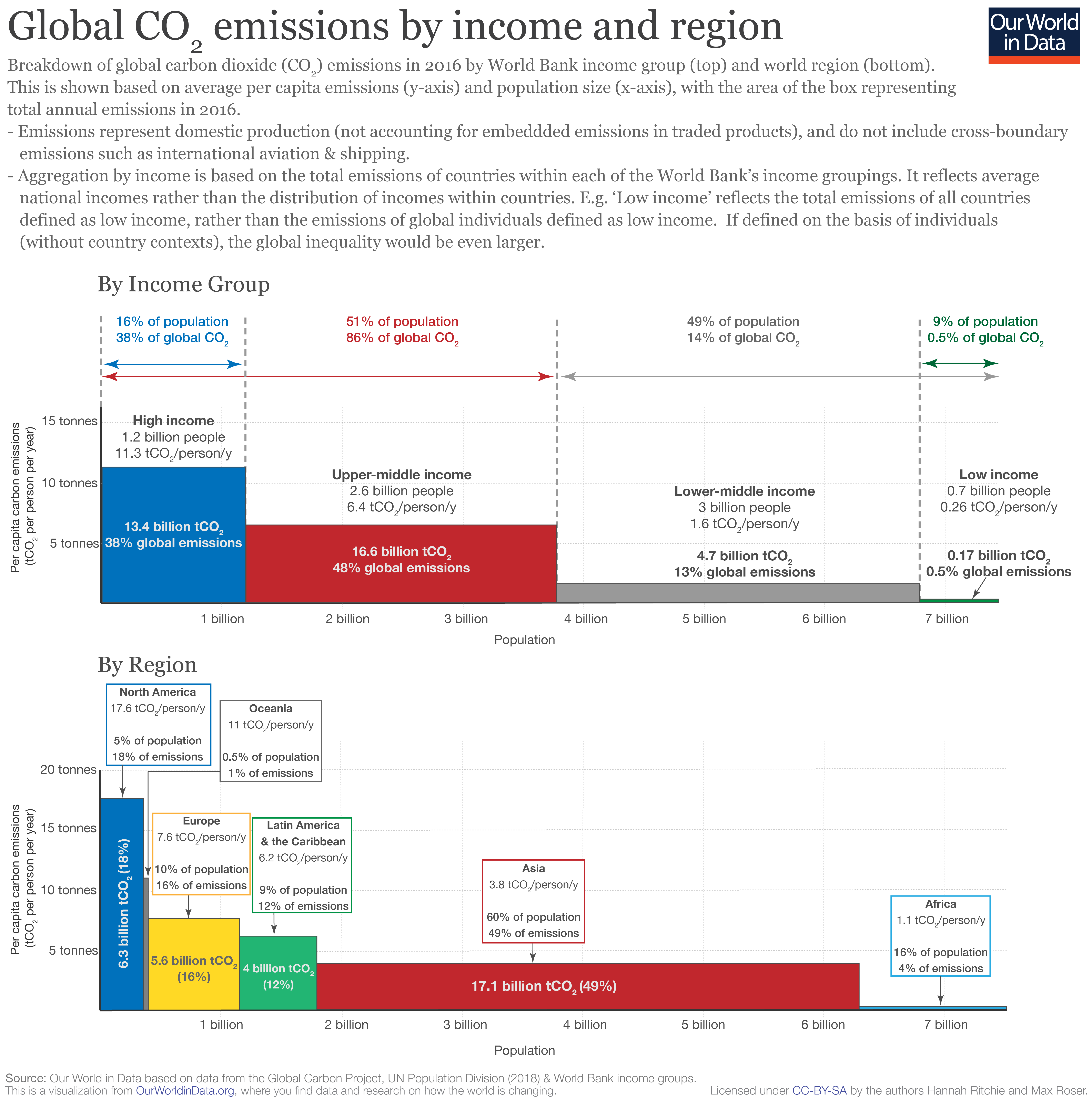
Coming back to Chancel and Piketty’s study4, the authors find that top 1% emitters account for 14% of global emissions, the top 10% for 45% of global emissions, the bottom 50% for 13%, and the bottom 10% for about 1% of emissions6. A similar analysis by Hannah Ritchie and Max Roser (“Global CO2 emissions by income and region”, OurWorldInData.org, October 2018), using World Bank income groups and considering only territorial emissions (that is not accounting for imports and exports), arrives at similar, although somewhat lower results, whereby the poorest 49% emits 14% of global emissions while the richest 16% produces 38% of global emissions.
A very recent research produced by Stockholm Environment Institute and Oxfam, using consumption emissions like Chancel and Piketty’s study, and published just a few days before this post, shows that 49% of global carbon emissions are generated by the world’s richest 10%, while the poorest 50% emit 7% of emissions. In other words, the richest 10% emit 7 times the emissions of the poorest 50%. (The Carbon Inequality Era, SEI and Oxfam, 21 September 2020. For a summary see: Confronting carbon inequality, Oxfam, 21 September 2020. The “dinosaur graph” of carbon emissions growth on page 4 is worth checking, as well as the press release).
Focusing on the global picture and on climate targets in the years ahead, the numbers are unambiguous. We need to halve emissions by 2030 and achieve net zero emissions by 2050 to remain below the objective of no more than 1.5°C warming, decided in 2015 at UN Climate conference in Paris. This represents a 45% decrease of CO2 emissions compared to their 2010 level (IPCC Special Report on Global Warming of 1.5°C7), or, using a different reference year and considering all greenhouse gas emissions and not only CO2, a 55% cut of emissions by 2030 compared to the 2018 level, which implies a yearly decrease of 7.6% on average (Emissions Gap Report 2019, UN Environment Programme1). Translating this target on a per capita basis, we need to go down to 2.5 tons CO2e per person per year by 2030 (Ivanova and Wood, 2020). As of 2020, we are very far from it. Quoting Ivanova and Wood5:
“Exploring the prerequisites for living well within carbon limits is a key focus of our time.”
1 Emissions Gap Report 2019, UN Environment Programme, 26 November 2019
2 Gütschow, J.; Jeffery, L.; Gieseke, R.; Günther, A. (2019): The PRIMAP-hist national historical emissions time series v2.1 (1850-2017). GFZ Data Services. <https://doi.org/10.5880/pik.2019.018>
3 CO₂ and Greenhouse Gas Emissions, section Per capita CO2 emissions, Hannah Ritchie and Max Roser, website OurWorldInData.org edited at the University of Oxford, December 2019
4 Chancel, L. & Piketty, T. (2015). Carbon and Inequality: From Kyoto to Paris. Paris School of Economics
5 Ivanova D, Wood R (2020). The unequal distribution of household carbon footprints in Europe and its link to sustainability. Global Sustainability 3, e18, 1–12. https://doi.org/10.1017/sus.2020.12
6 Chancel and Piketty4 find that emissions per capita per year in the top 1% exceed 200 ton of CO2e, and can go as high as 320 ton CO2e. This is about 50 times the world average emissions per capita. These figures are in line with more recent research, see for instance: Otto, I.M., Kim, K.M, Dubrovsky, N., Lucht, W. (2019), Shift the focus from the super-poor to the super-rich, Nature Climate Change, 9: 82-94. Behind these numbers, Ivanova and Wood (2020) find that land and air transport, both highly carbon intensive, represent a particularly large of share of the footprints of top emitters.
7 Masson-Delmotte, V., Zhai, P., Pörtner, H.-O., Roberts, D., Skea, J., Shukla, P. R. et al. (eds) (2018). IPCC Special Report 1.5 – Summary for Policymakers. Intergovernmental Panel on Climate Change.
